Nordstrom Site Redesign
Homepage & Landing Pages
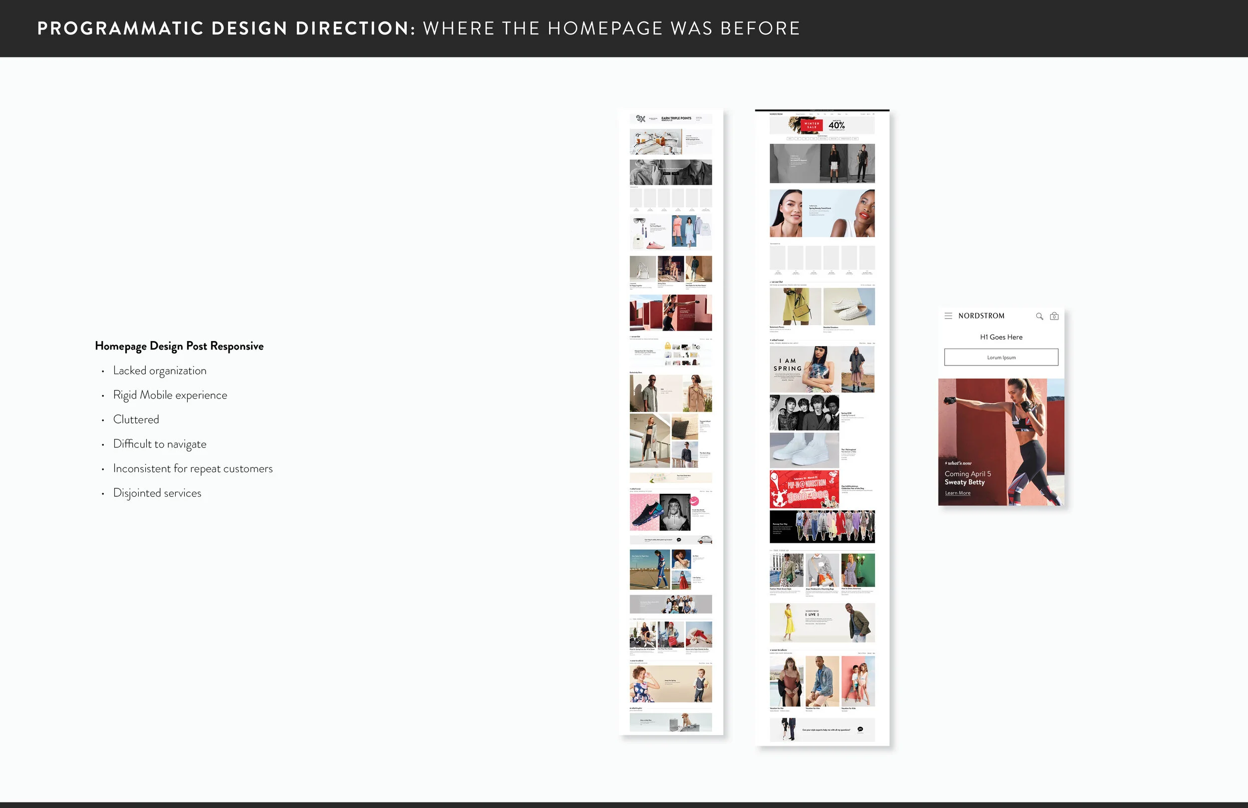
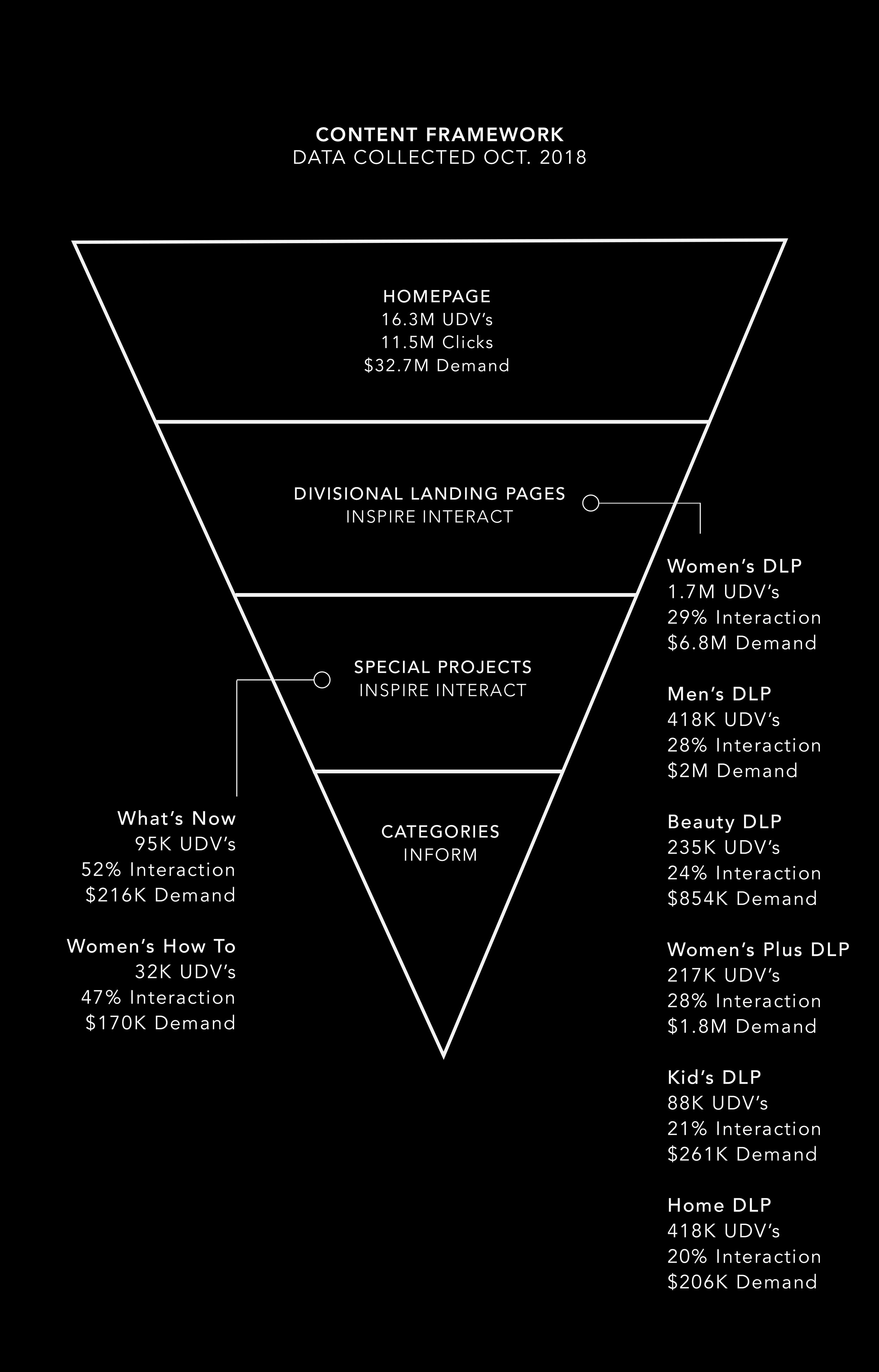
Nordstrom has been around for more than 100 years delivering the best customer experience. The Homepage is where the customer journey begins for most shoppers, therefore the Homepage should be the best customer experience. I was the designer for the Homepage for nearly 2 years, within this timeframe I led the re-design of the Homepage and all high level landing pages. Nordstrom’s Homepage has the highest demand and conversion rate on the site, it does 15-18MM on a normal day and 64MM on an above average day.
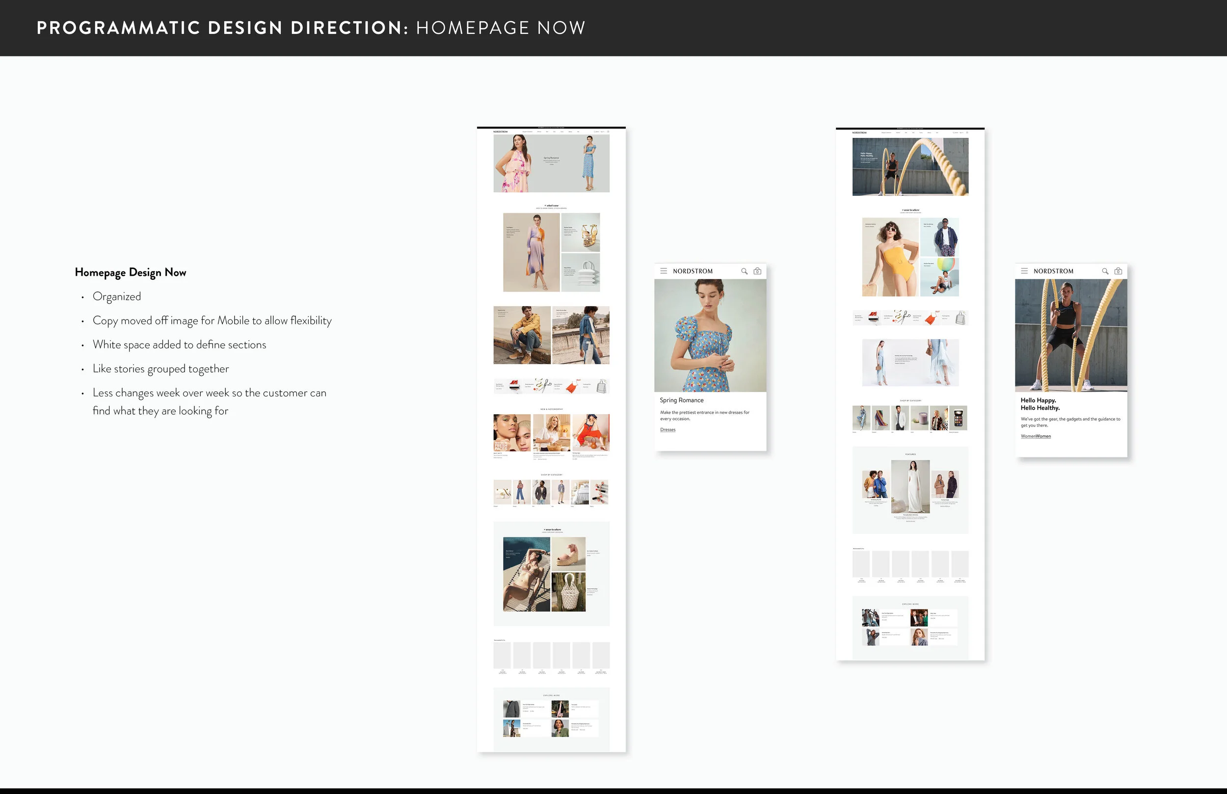
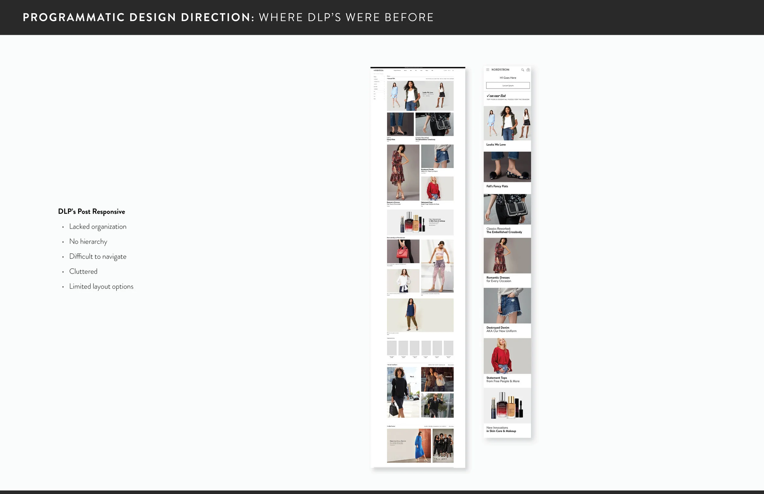
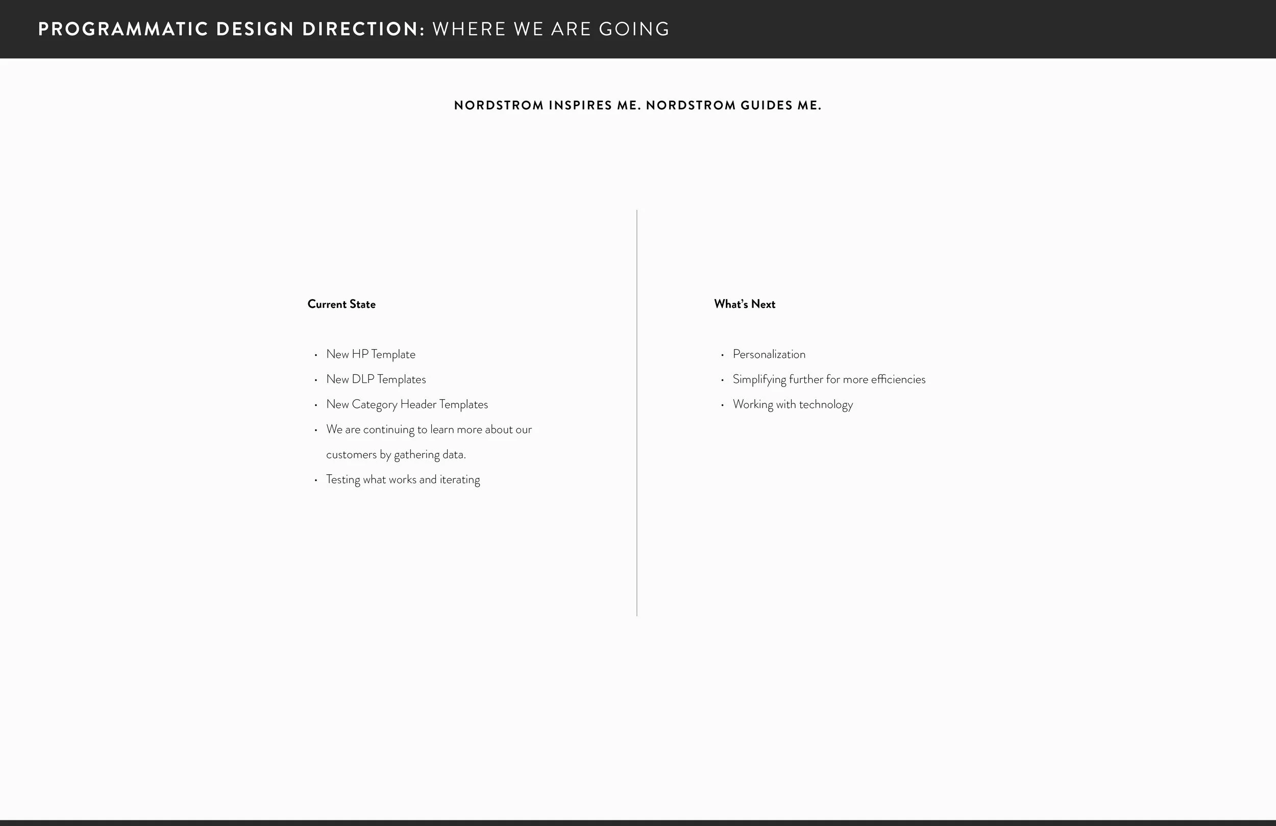
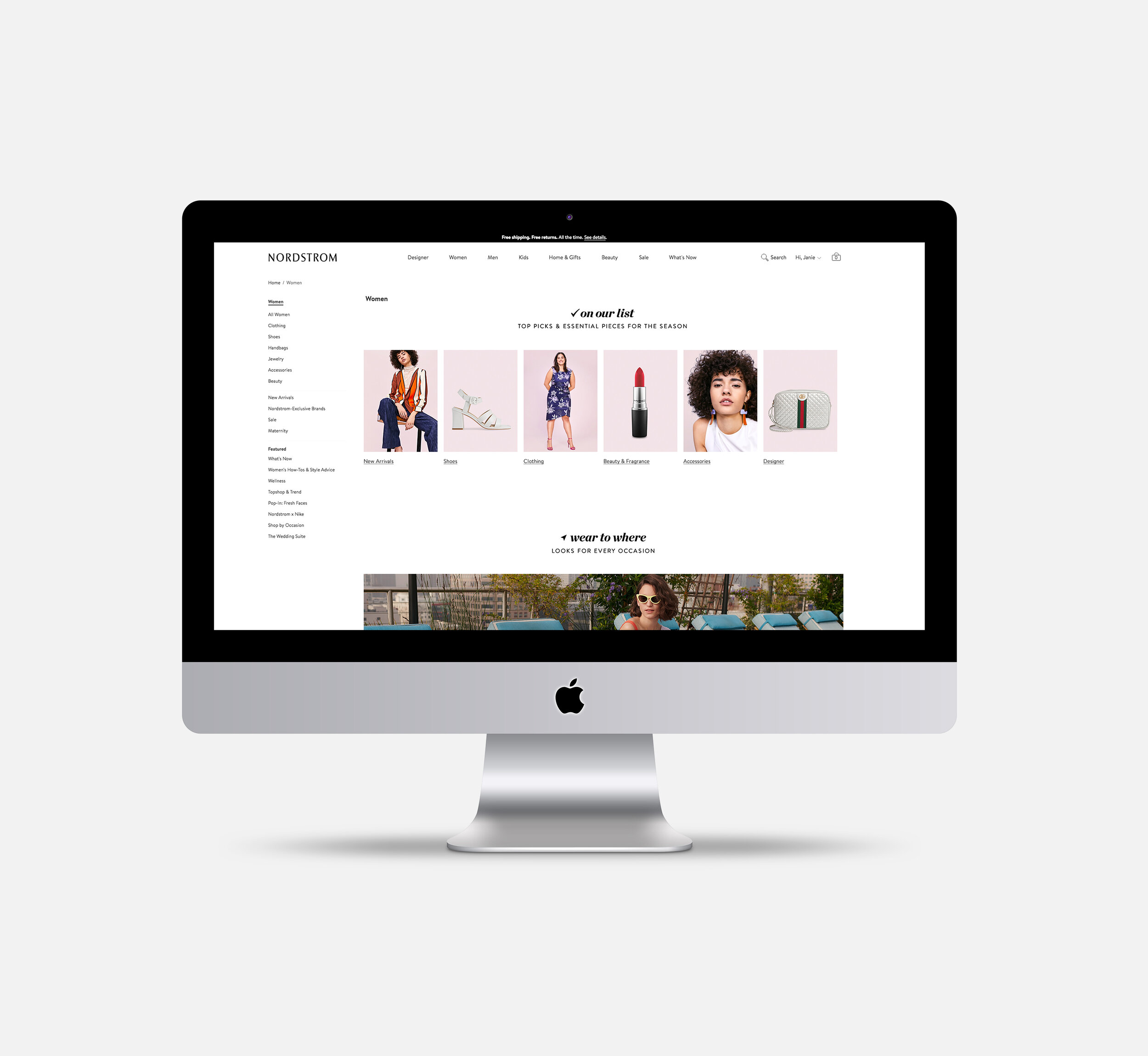
The goal of this project was to create a better experience for customers starting with the Homepage and extending to all high level Department Landing Pages. Data tells us the easier it is for customers to find what they are looking for and engage in inspiring content the higher the conversion.
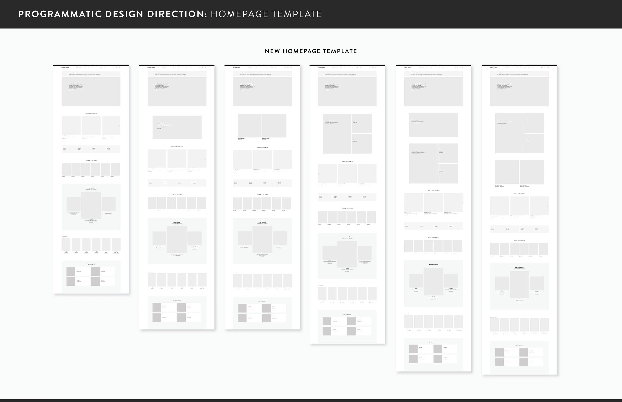
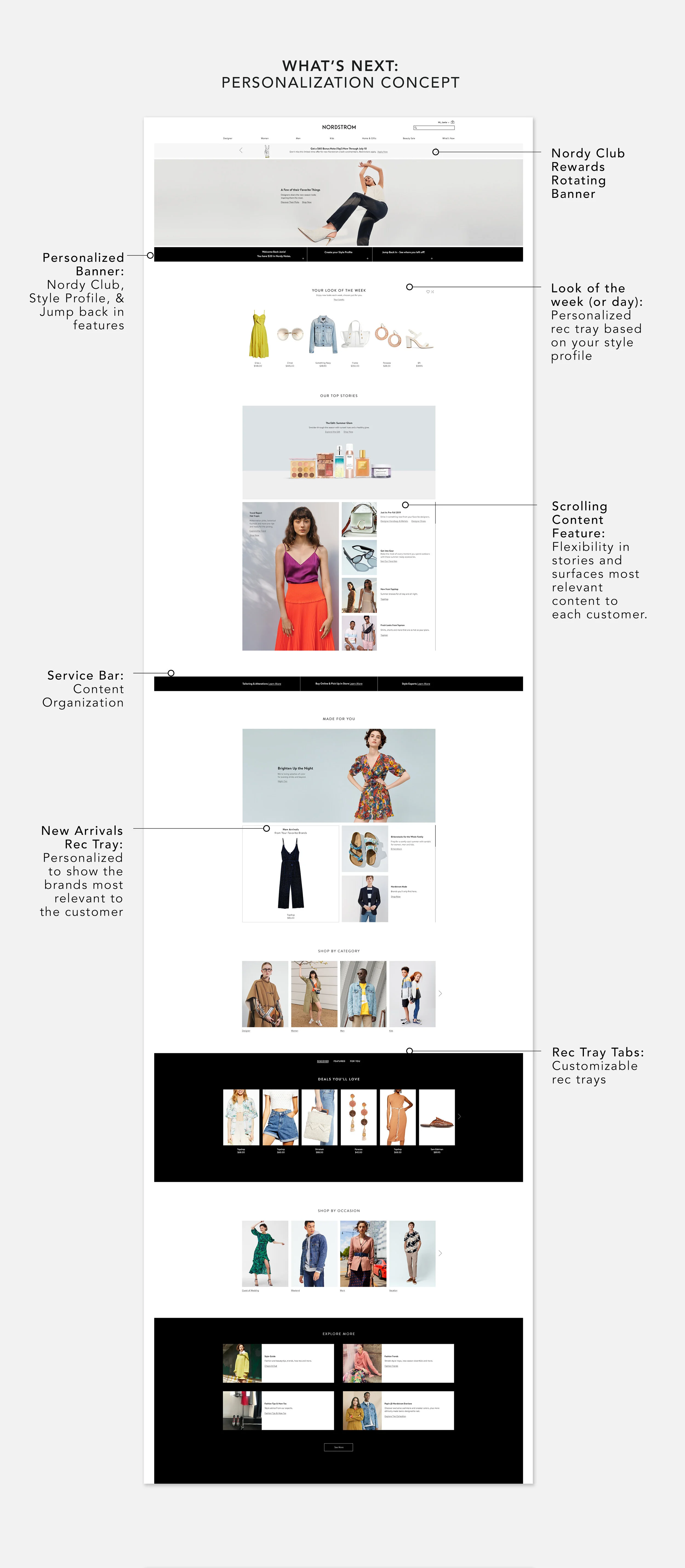
As the lead designer for this project I partnered with leadership on customer priorities, business needs, and used market research to develop a better experience. I presented direction and wireframes to Digital Merchandising and Product Management, they were approved and went live in 2019.
In addition to the redesign, I worked with UX and Developers to deliver new site enhancements including additional live text sizes and the Explore More Carousel. Adding a new headline size allows for visual hierarchy and more live text on the site improving SEO value. Another problem I was tasked in solving was the need for animation on the site with size restrictions in order to improve bounce rate due to loading time. The solution I worked on with developers was a faux gif this enhancement mimics a gif, but because it lazy loads each image the performance of the page is not effected. This was a huge win as far as elevating creative.
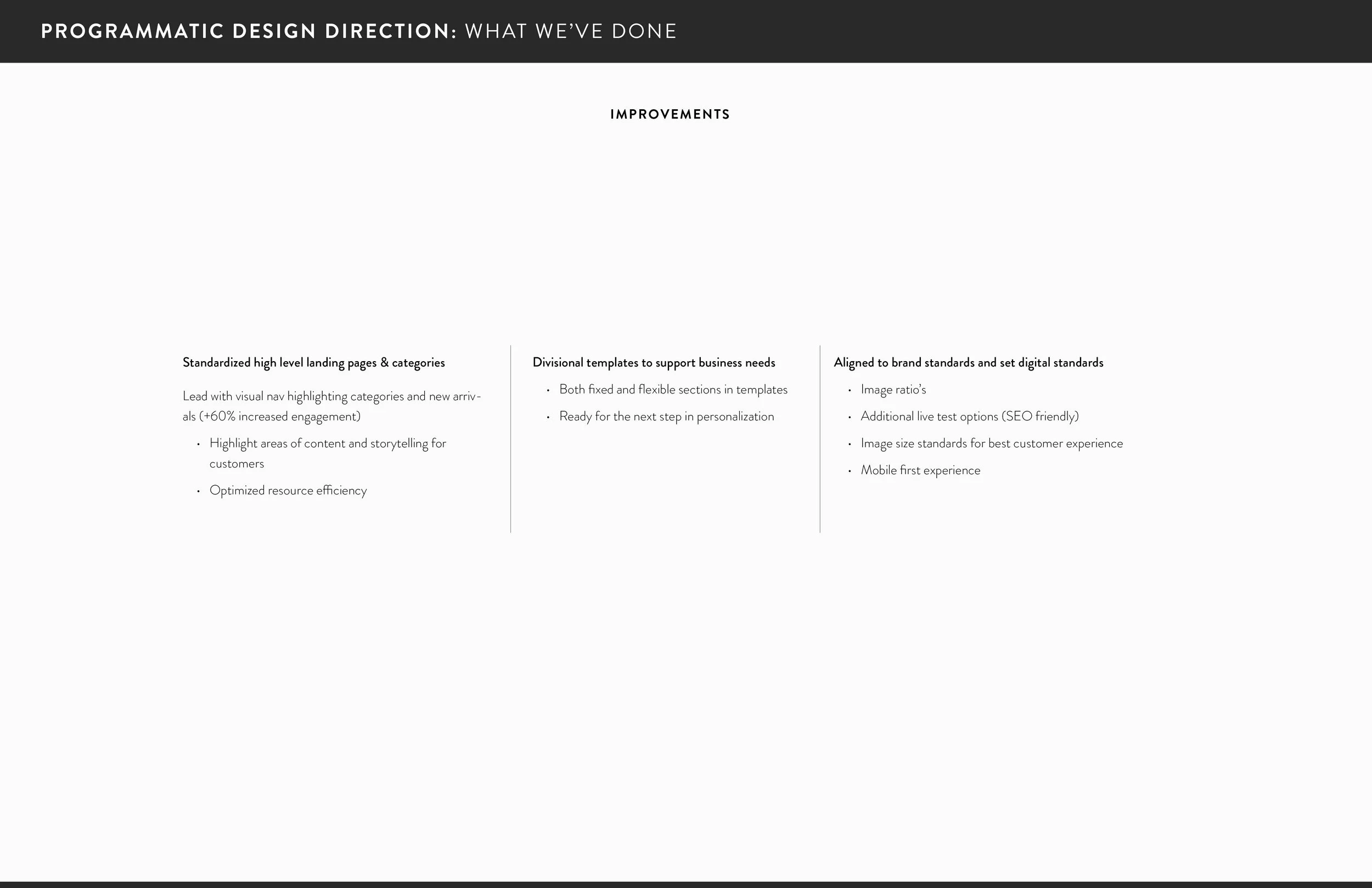
Results: The new design and features developed have resulted in $150 million in incremental demand for the Homepage and all high level landing pages. Adding Shop by Category to both the Homepage and DLP’s increased engagement by 60%, this helped guide customers on their shopping journey and increased demand.
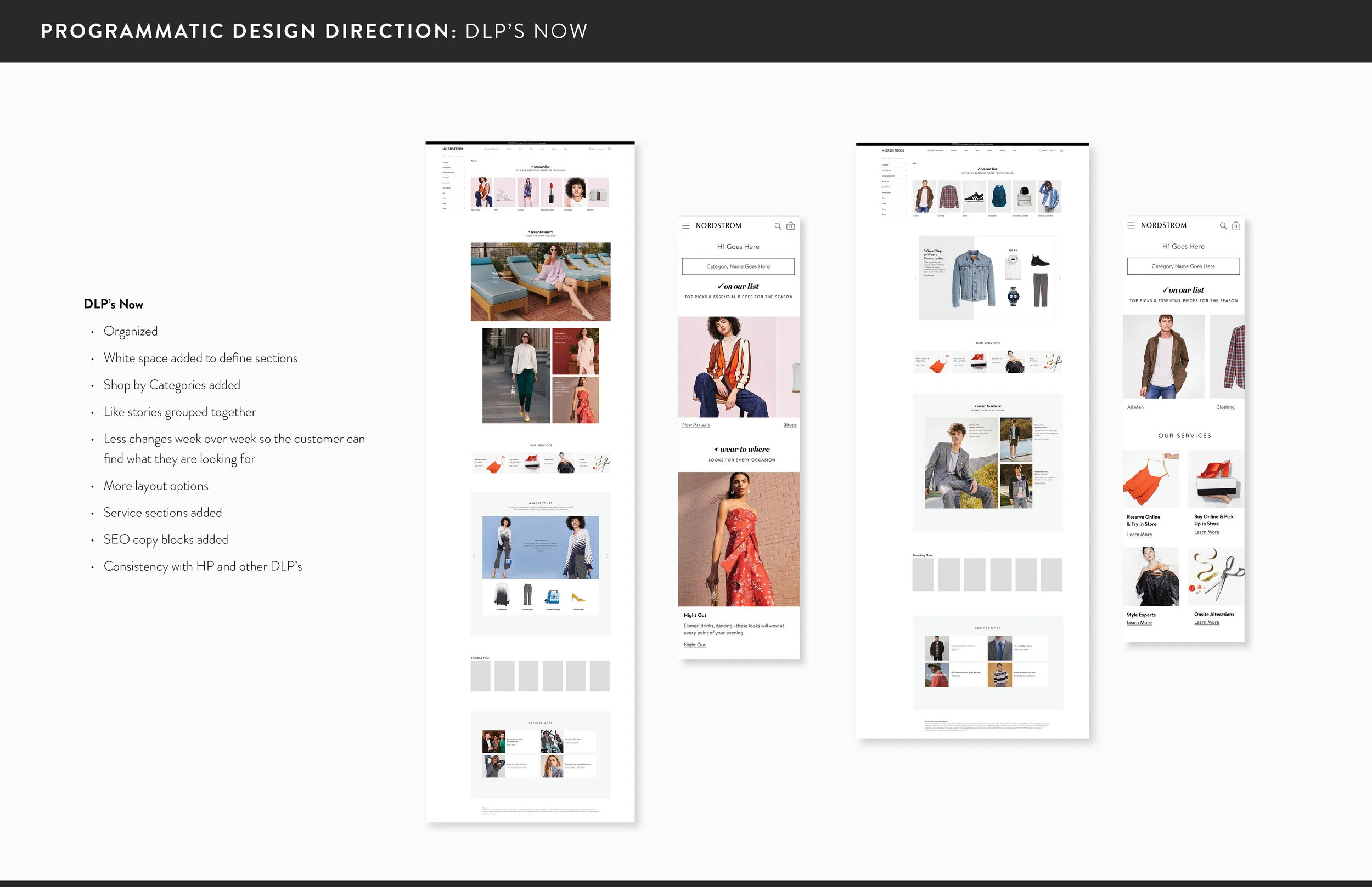
Nordstrom is known for being a first class customer service company. Creating service bars for all of the landing pages creates consistency for our customers and improves awareness on Nordstrom’s service offerings.
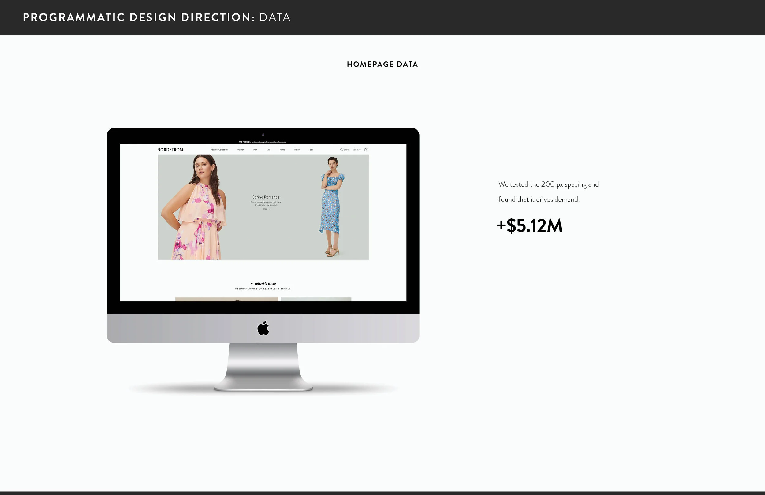
Adding additional white space between content sections increased demand on the Homepage alone by 5.12M yearly. The white space allows the customer to focus on what inspires them and elevates the creative. This was applied to all landing pages after testing.
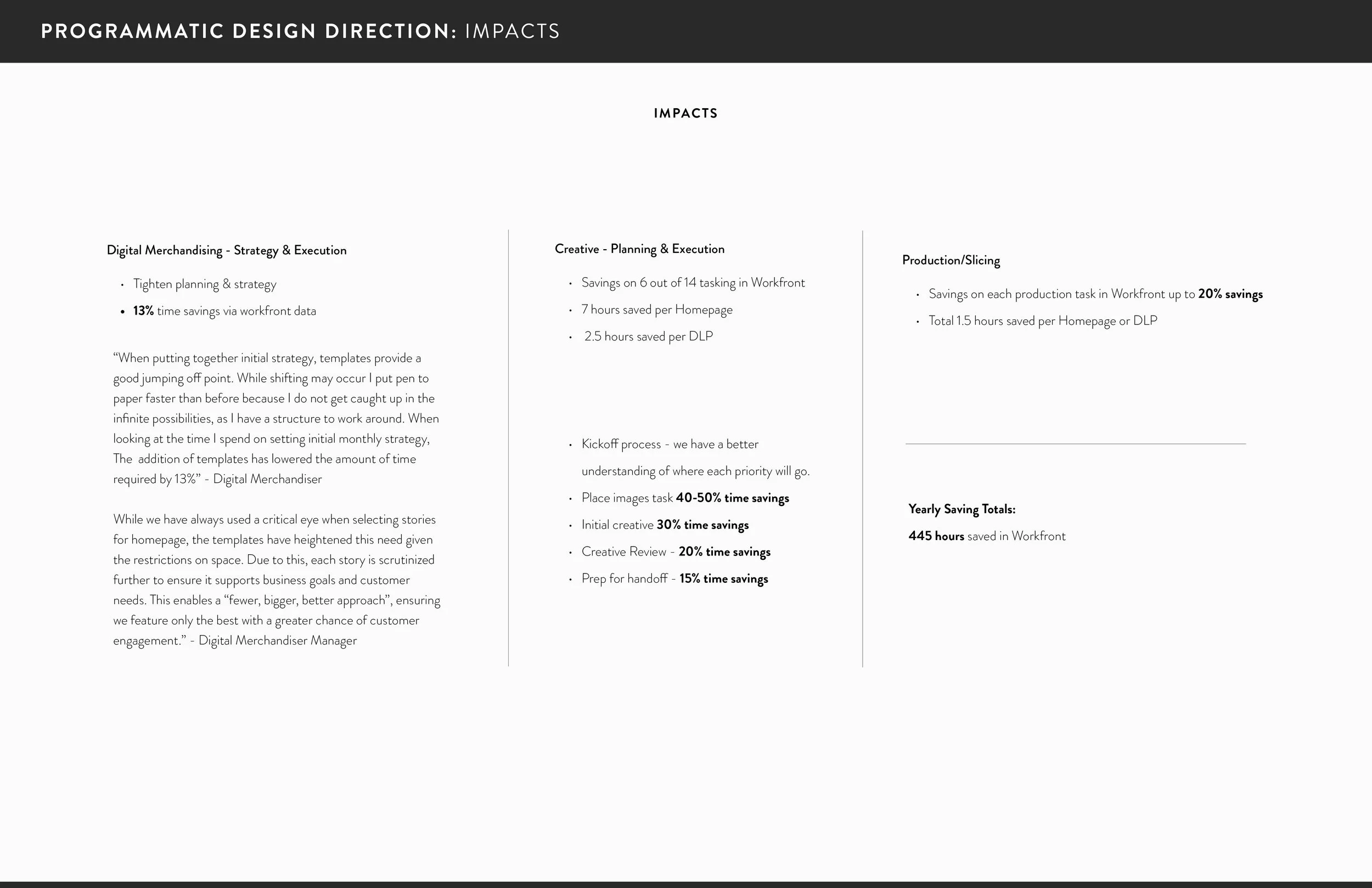
Creating these templates improves efficiencies by saving 445 hours yearly on the Homepage between Project Management, Digital Merchandising, Design, Copy, Production, and Content Management. This also applies to each of the top level DLP’s: Women’s, Men’s, Kid’s, Home, Beauty and Sale.
UX | UI | Wireframes | Design | Content Organization | Concept | Execution | Strategy






Design/Concept/Research/Strategy: Janie W.

